Service
Timeline
Year

(Overview)
Usage Context and Passenger Needs
We analyzed the usage context of public transport displays, considering crowded environments, changing viewing angles, motion, noise, and time pressure. Particular attention was given to the diverse passenger groups using the line, including commuters, tourists, elderly passengers, and people with disabilities.
Comparative Analysis
As a team, we conducted field research across multiple transport modes such as buses, trams, subways, suburban trains, and ferries, supported by desk research. This comparative analysis focused on typography, color usage, iconography, maps, points of interest, and the hierarchy of displayed information.
Mental Models
We discussed and evaluated different mental models for presenting route progress, stop sequences, and orientation. Decisions such as linear stop lists, direction of progression, and icon familiarity were made to support fast comprehension without prior explanation.
Accessible Design
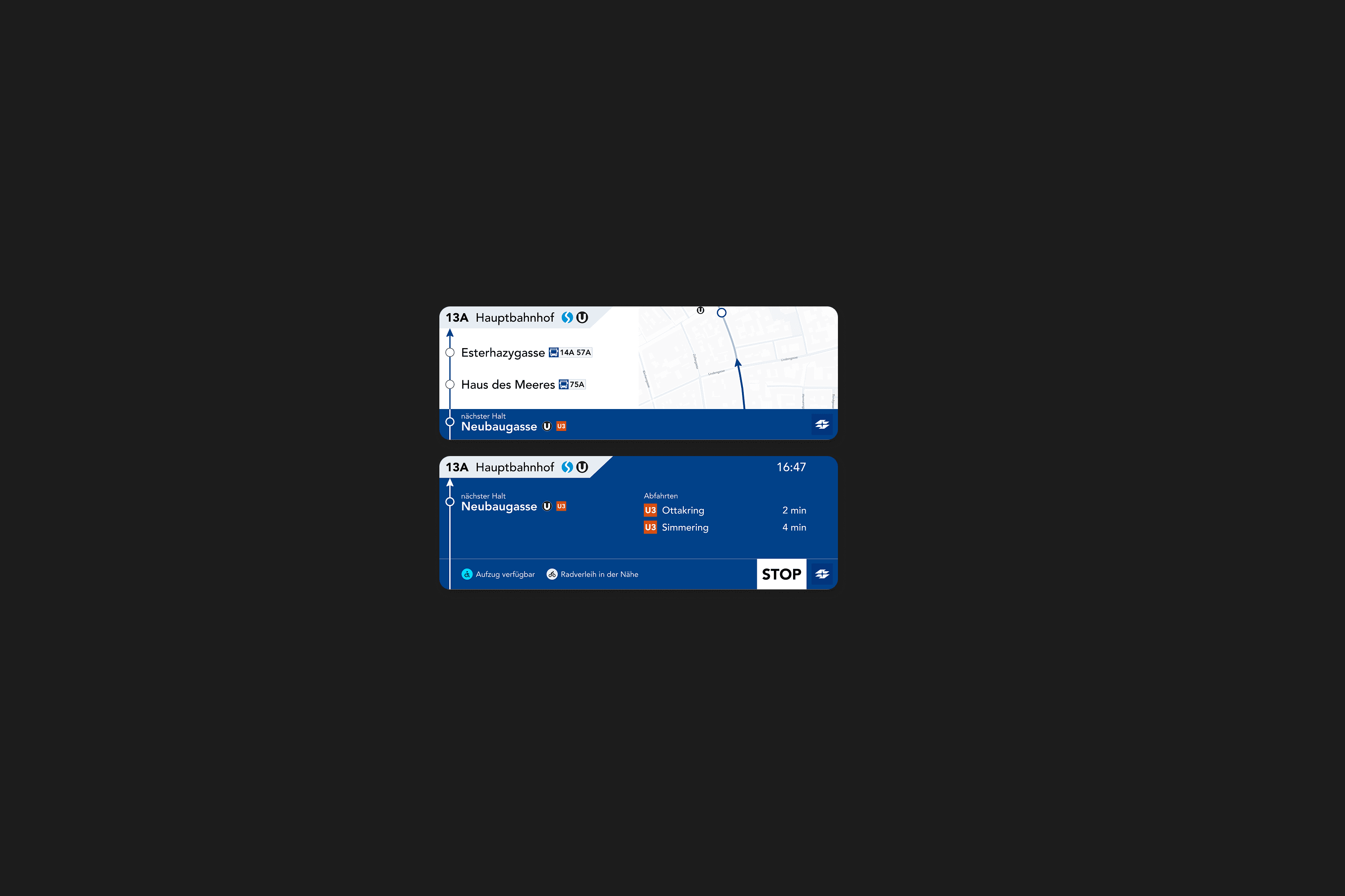
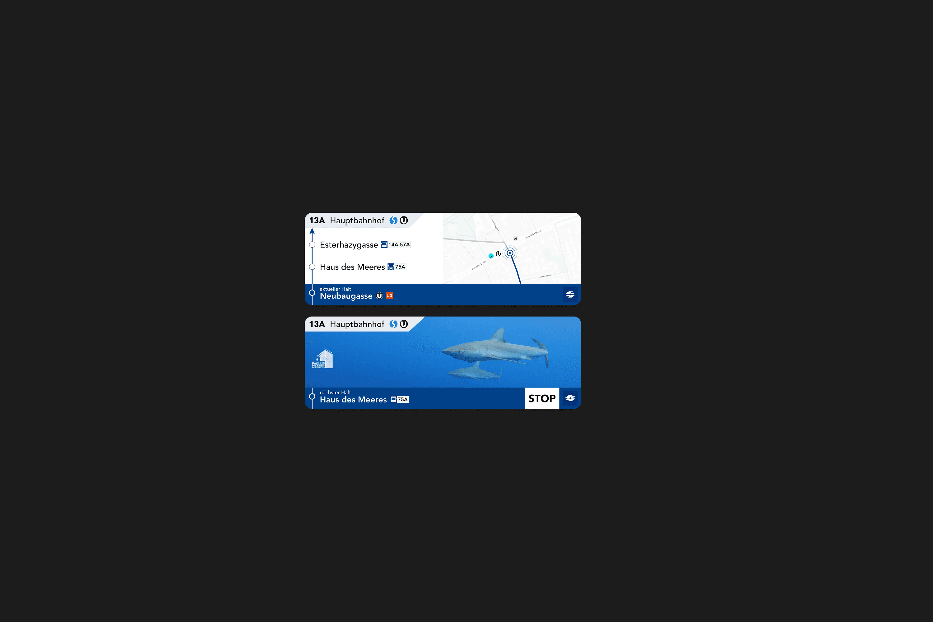
The display concept was designed with accessibility as a core requirement, emphasizing high contrast, large typography, clear color coding, and consistent icon usage. Language switching, reduced information density, and clear prioritization of “current” and “next” stops supported readability from all positions inside the bus.
Display Prototype
Research findings were translated into a high-fidelity prototype covering main displays and additional side screens. The concept demonstrated how route information, maps, transfer options, and secondary content such as service notices or advertising could coexist without disrupting orientation or clarity.